Step 1. Create Guidelines
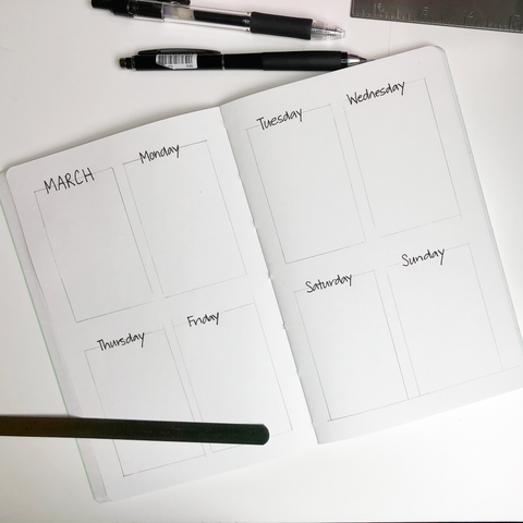
This is where I spent most of my time because I find that it helps the following steps flow more easily. I measured equal distances from the edges to ensure I could get equal boxes, or as close as possible.

Step 2. Add Headers
Next up, I added the headers for each block in my regular handwriting, nothing fancy this week. With this style of layout I usually have a calendar view of the current month in the first box and then of course the other boxes are for each day of the week, I start my week on Mondays.

Step 3. Add Design
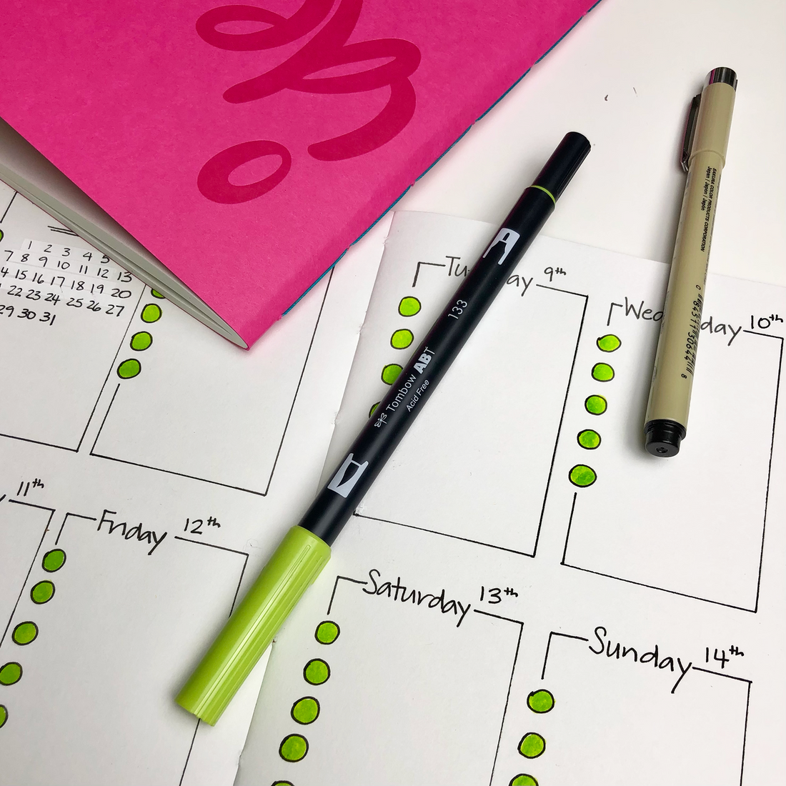
Moving on to the fancy stuff. In this case, this week's fancy is simple and easy to achieve, just circles (dots) on the left side of each block.
Step 4. Add a little Color
The final and the easiest step is adding a bit of color to the mix.
Rushing through this layout and I made lots of mistakes even with the use of guidelines. I could have flipped the page and created a new spread, made it "perfect" but I didn’t have the time. I used some "wite-out" and I was able to make corrections and get it all done and right now, done is better than perfect. Now to fill this in with all this work that needs to get done for the week.

Tools I used:
- Large notebook with blank pages from Add Pink and Stir
- Tombow ABT Marker from Michaels
- Micron Fine Point Pen from Michaels
- Right-angle ruler similar to this one from Amazon
- Mini ruler similar to this one from Amazon
Let me know if you try this one, it's a great bullet journal layout if you are a beginner or if you are short on time.


